Chip
The Chip element is in beta. It may not be turned on for your account yet. To request access, contact Paminga Support.
A Chip is a small, styled label: the "New" on a product announcement, the "Webinar" over an event listing, the "Limited Time" beside an offer. It's the quickest way to call out a category or status without reaching for an image or hand-styling a paragraph.
Chips are available in the Email, Form, Landing Page, and CTA builders.
Chips Call Out a Category or Status at a Glance:

Add a Chip
Add a Chip the way you add any other element: click the + icon in the builder and choose Chip (searching "tag", "badge", "pill", or "label" finds it too). It arrives reading "New" with a neutral grey background, ready to edit.
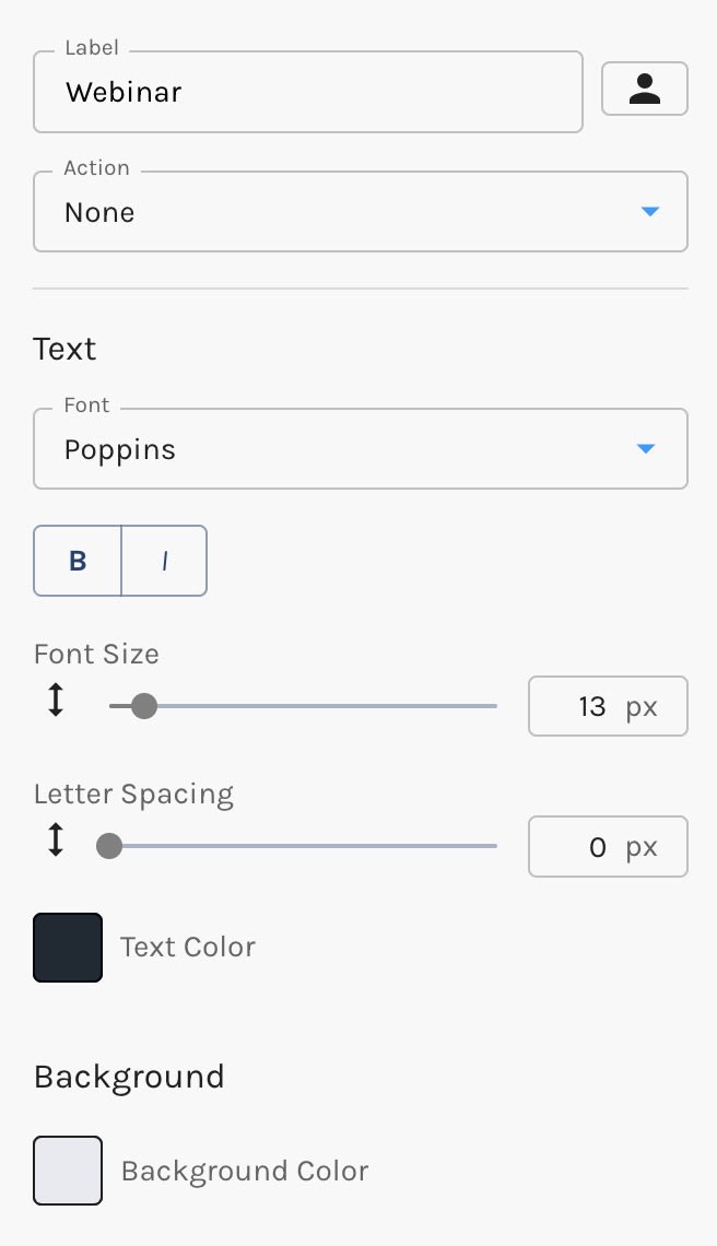
Select the chip to open its settings in the Chip tab on the right.
Label
Type the chip's text in the Label field. The field accepts tokens, so a chip can show a value that's personalized for each contact — see Personalization for emails, forms, landing pages, and CTAs.
If you translate your asset into other languages, the label is translated along with the rest of its text.
Make a Chip Clickable
A new chip is a plain tag: its Action is set to None, so clicking it does nothing. Choose a different action to turn it into a link:
| Action | Available in |
|---|---|
| Redirect to URL | All builders |
| Download a File | All builders |
| Compose an Email | All builders |
| Dial a Phone Number | All builders |
| Scroll to Anchor | Forms, landing pages, and CTAs |
| Open a Popup | CTAs (popups) |
Once a chip has an action, forms, landing pages, and CTAs also offer Record as Conversion. Turn it on and a click on the chip is recorded as a conversion for the asset, the same way a button click is.
Style a Chip
A Chip's styles are set on the chip itself. Your Brand Kit has no chip-specific settings, so the chip uses the defaults below until you change them. The one exception is its font: until you choose one, a chip uses your asset's body font, and keeps following it if that font changes.
Text
- Font — defaults to your asset's body font
- Bold and Italic — chips are semi-bold by default
- Font Size — 8 to 64px (default 13px)
- Letter Spacing — 0 to 10px
- Text Color
Background
- Background Color
- Hover Color — the background shown when a visitor hovers over the chip. Not offered in emails, because email clients don't support hover effects.
Shape
- Corner Radius — 0 to 100px. Zero is a square-cornered tag; anything large enough becomes a full pill, at any font size.
- Border Width — 0 to 20px. Chips have no border by default.
- Border Color
- Border Style — Solid, Dashed, or Dotted, shown once the chip has a border
Padding
- Horizontal Padding — 0 to 64px (default 12px)
- Vertical Padding — 0 to 40px (default 6px)
In emails, the color pickers don't offer transparency. Many email clients can't render semi-transparent colors, so Paminga doesn't let you choose one there.
Chip Settings: