Radio Button Group
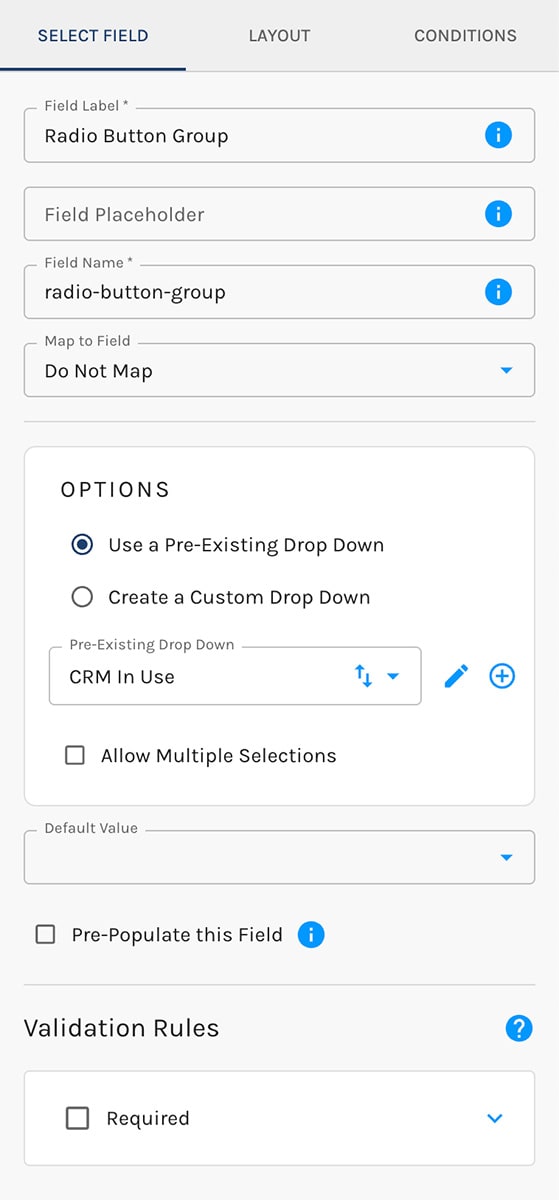
The Radio Button Group element presents an enumerated set of pre-defined options.
Much like the Select element, you can determine the options presented in your Radio Button Group in one of two ways:
- Use a Pre-Existing Drop Down
You may create and store any number of reusable drop-downs in Paminga - Create a Custom Drop Down
Create your options on-the-fly for use in your form
When you use a pre-existing Drop Down, you can also choose which of its options appear on this form.
Use a Select element to provide a searchable drop-down consisting of enumerated options.
Show Answers as Tiles
By default, a Radio Button Group is a plain list: a circle beside each answer. Switch it to tiles and each answer becomes its own card, with a background, border, and padding, that changes color when a visitor hovers over it and when they select it. Tiles make a short list of choices feel like buttons, which suits plan pickers, "which best describes you?" questions, and anywhere you want the answers to carry visual weight.
Tiles are a style, so they live with your other form styles rather than on the individual field:
- Open your form's Styles and expand Radio / Checkboxes.
- Under Background Type, choose Tiled (the default is No Background).
- Set the tile's look with the controls that appear:
- Background Color, Text Color, and Border Color
- Border Width, Corner Radius, Horizontal Padding, and Vertical Padding
- Hover Background Color and Hover Text Color, for an answer under the visitor's pointer
- Selected Background Color and Selected Text Color, for the answer the visitor has chosen
The radio circle follows the hover and selected text colors, so it stays visible on a dark tile. A text color you leave unset follows your field label color.
Because tiles are a style, they apply to every Radio Button Group on the form, and to the radio buttons of Yes / No fields. Checkboxes are not drawn as tiles.
The same Background Type switch and tile controls appear under Radio / Checkboxes in your Brand Kit. Turn tiles on there and every form using that Brand Kit gets them. A form can still switch tiles on or off for itself, and revert to the Brand Kit's setting at any time.
Tiles are not drawn when your form uses Use Styles from My Site, which renders plain HTML radio buttons that take their look from your website.
Radio Answers Drawn as Tiles:

Tile Settings: