Layout Control
Paminga's Form Builder uses a simple structure:
- An outer Wrapper that may be styled to your liking
- Your Wrapper must contain at least one "Section" (create as many as you like)
- Each Section contains at least one "Row" (create as many as you like in any Section)
- Each Row contains at least on "Element" – an image, heading, form field, "compositions" for abandoned cart, product recommendations, upcoming events, blog posts/articles, etc.
You may add as many Elements as you like within any Row.
wrong: /docs/marketing-center/emails/emails-builder/styling/#layout right: /docs/marketing-center/emails/email-builder/styling/#layout
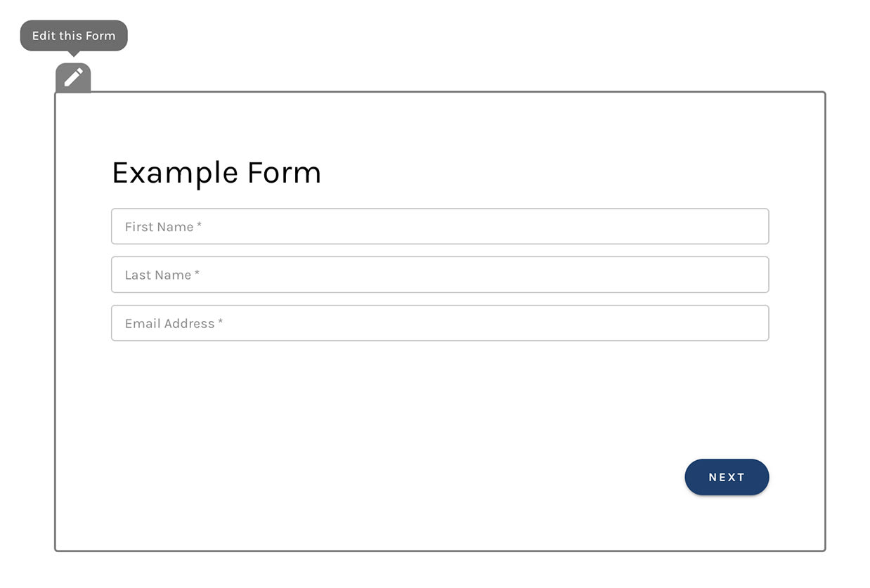
Wrapper
The Wrapper reveals a gray outline when hovered with your mouse. You'll see two icons:
Asset Wrapper:
Sections
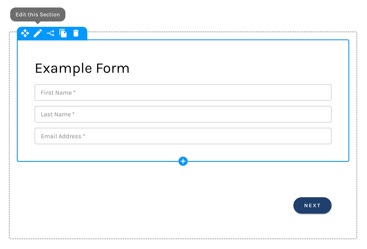
Each Section reveals a blue outline when hovered with your mouse. Hovering a Section exposes 6 icons:
- Move the Section via drag and drop
- Edit the Section's properties, including layout and design
- Display the Section Conditionally
- Clone the Section
- Delete the Section
- A Help link to these Docs
A Section:
Adding a Section
When you create a new Section you must add at least one Row within it.
Using the Template Library
It's easy to save Sections to Paminga's Template Library and re-use them at will.
Rows
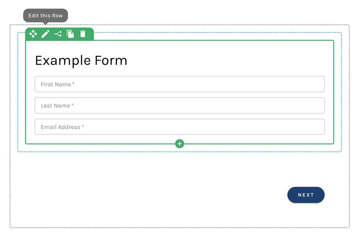
Each Row reveals a green outline when hovered with your mouse. Hovering a Row exposes 6 icons:
- Move the Row via drag and drop
- Edit the Row's properties, including layout and design
- Display the Row Conditionally
- Clone the Row
- Delete the Row
- A Help link to these Docs
A Row:
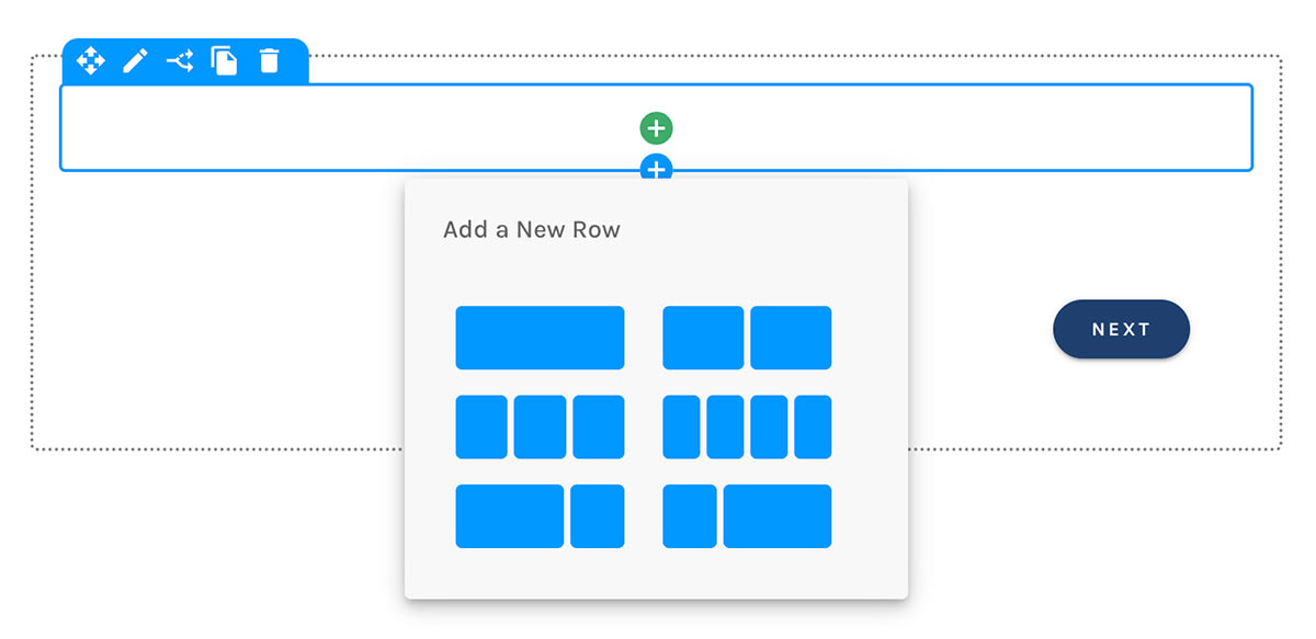
Adding a Row
When adding a Row, you must choose how you would like your Row to be divided:
- Full width
- Half and Half
- Thirds
- Fourths
- Two thirds / One third
- One third / Two thirds
Adding a Row:
Rows Leverage Responsive Design
Rows that are divided into two or more Blocks (halves, 3rds, 4ths, etc.) adjust such that they are arranged vertically, one block above the other, on mobile devices, and when the asset's container, usually an html <div> tag, does not allow enough horizontal space for the blocks to be arranged horizontally.
This is known as "Responsive Design".
Using the Template Library
It's easy to save Rows to Paminga's Template Library and re-use them at will.
Blocks
Each "division" within a Row is contained in a "Block".
Blocks do not currently expose any controls, but we plan on adding layout controls for Blocks soon.
Elements
Paminga offers many elements – like product listings, upcoming events, articles, pricing blocks, headings, images, and more – that you may add to your asset as you choose.
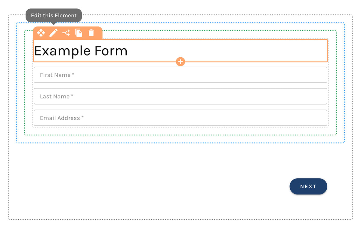
Each Element reveals an orange outline when hovered with your mouse. Hovering a Element exposes 6 icons:
- Move the Element via drag and drop
- Edit the Element's properties, including layout and design
- Display the Element Conditionally
- Clone the Element
- Delete the Element
- A Help link to these Docs
A Heading Element:
Using the Template Library
It's easy to save Elements to Paminga's Template Library and re-use them at will.
Group Fields Under a Label
Container field labels is in beta. It may not be turned on for your account yet. To request access, contact Paminga Support.
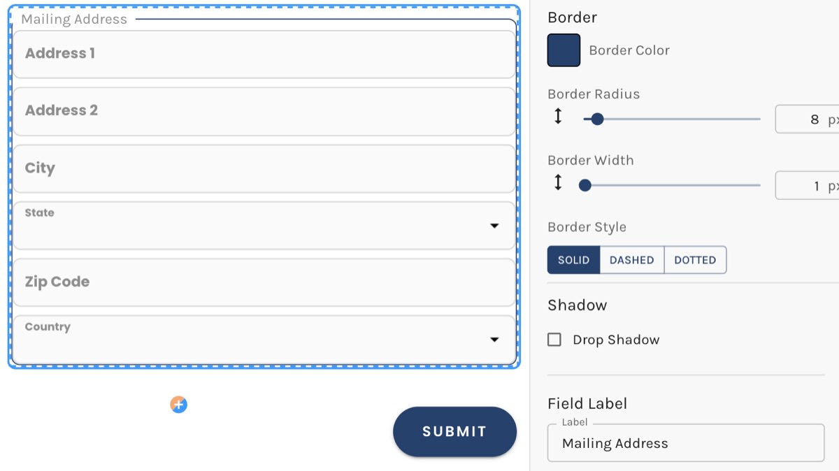
Some fields belong together: the parts of a mailing address, a set of event preferences, the details of the person you're registering on someone else's behalf. Give the container that holds them a label and it's drawn as a labelled group, with the label set into the container's border.
Select the container, open its Design tab, and type into Label under Field Label, below the border settings. Leave it empty and the container looks exactly as it always has.
A labelled container is more than a visual frame. It's published as an HTML <fieldset> with a <legend>, so screen readers announce the label as the visitor moves into the group, and the fields inside read as related.
- Give the container a border so the label has a line to sit in. The border settings are directly above the label.
- The label stays on one line. A label too long for the container is cut short with an ellipsis, and the full text still reaches screen readers and appears when a visitor hovers over it.
- The label is translated along with the rest of your form.
- Its font, size, weight, and color come from Field Label in your Brand Kit, and you can override them for this form under Styles > Field Label.
- The label is unavailable while the container uses a true-size background image.
Container labels are also available in the Landing Page and CTA builders. They are not offered in emails, where <fieldset> support among email clients is too unreliable to use.
A Container Drawn as a Labelled Group: