Styling Your Forms
Styling starts (and commonly ends) by choosing a Brand Kit to use with your Form.
You may however, choose to override styles inherited from your Brand Kit nearly everywhere.
You have substantial control over the layout, design, and style of your Forms.
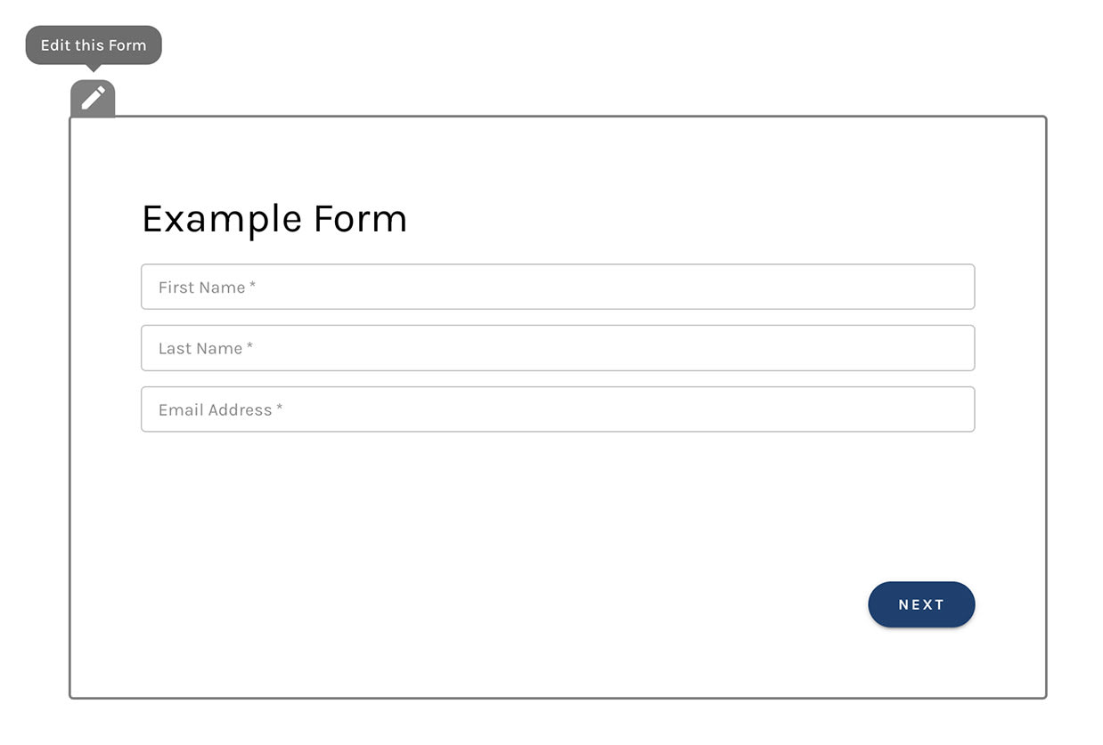
Access these controls by clicking the gray "Edit" icon that appears when hovering your form's Wrapper.
Wrapper:
Layout
The first setting you'll see here is a checkbox labeled "Stretch to fit its container".
With this box checked, your form's width will not be set explicitly.
Rather, your form will "stretch" to fill the "container" it's embedded in (usually an html <div> tag).
Leaving this box checked is the best practice that is commonly preferable to setting your form's width explicitly.
Websites that leverage "responsive design" (layouts that adjust when viewed on laptops, tablets, and phones) can be "broken" by items that require an explicit width. Such an item is unable to be "responsive" on different devices.
Best practice: leave this box checked 🙂
Margin
Use the sliders, or type in values directly to set margin on all four sides of your form.
Padding
Use the sliders, or type in values directly to set padding on all four sides of your form.
Layout Settings:

Design
You may set a background, image, color, or gradient for your form, as well as a border.
Design Settings:

Styles
Styles are commonly controlled by your Brand Kit, but you may override brand kit settings to customize most styles on-the-fly.
You have control over
- Font family
- Font size
- Font color
- Letter spacing
...for form fields, typography like headings and paragraphs, buttons, and validation error messages that may appear as prospects interact with your forms.
Buttons provide additional controls for borders and hover states.
Style Settings:

Form Field Styles
Forms carry a few style controls that other builders don't need. Each one is set in your Brand Kit and can be overridden for an individual form under its Styles.
Label Weight and Emphasis
Field labels take a weight, not just a font, size, and color, so you can bold them to match a site whose own forms do.
- Text Fields controls the labels on text-style fields: a B / I / U button group (bold, italic, underline) above a Label Font Weight slider (100 to 900). B toggles between 400 and 700.
- Radio / Checkboxes offers the same pair, with a Font Weight slider, for the label above a group of radio buttons or checkboxes.
Field Padding
Text Fields also sets the space between a field's border and the text inside it:
- Vertical Padding (0 to 40 pixels) sets the top and bottom together
- Horizontal Padding (0 to 48 pixels) sets the left and right together
Use these to make fields roomier or more compact to match the rest of your site.
Radio Answers as Tiles
Radio / Checkboxes can draw each radio answer as its own tile, with hover and selected colors. See Show Answers as Tiles.
Hints
The Helper Text section sets the font, size, and color of field hints.
Label Weight and Field Padding: