CTAs Dashboard
The CTAs dashboard shows how often your Calls to Action are seen, how often they get a response, and on which pages of your site they earn it. Compare every CTA at once, or pick one to see the pages it runs on and the people acting on it.
Every number opens the contacts and events behind it.
Find it under Reporting › Dashboards › Forms & Pages › CTAs, or Marketing Center › Calls To Action › CTAs Dashboard. You can also open a single CTA's dashboard from:
- The View Dashboard icon on a CTA's row in your CTA list
- The Stats Dashboard button at the bottom of the CTA Builder, once the CTA is published
- View Dashboard on a CTA's menu in the Finder
Where a CTA Converts, and Who It Reaches:
All CTAs or One CTA
Use the dropdown at the upper left.
- All CTAs (the default) reports on every CTA together and adds an Asset Breakdown table, one row per CTA.
- One CTA reports on that CTA alone. The pencil icon next to the dropdown opens it in the CTA Builder, and the folder icon shows it in the Finder.
Mark either view as a favorite with the heart icon.
Date Range
The date range at the upper right defaults to the last 30 days. Data starts on May 5, 2026, so the picker won't go earlier than that.
What Counts as an Impression and a Conversion
- Impression: the CTA was displayed to a visitor.
- Conversion: the visitor acted on it. That includes clicking a button, link, image, or social share in the CTA, and submitting a form embedded in the CTA. A Custom Event set to Counts as Conversion counts too.
The Numbers at the Top
- Impressions
- Conversions
- Conversion Rate: conversions divided by impressions.
- Unique Contacts: how many different known contacts saw the CTA.
Each card compares itself to the period of the same length immediately before your date range. Conversion Rate shows its change in percentage points.
Click Impressions, Conversions, or Unique Contacts to see the events and contacts behind them.
Asset Breakdown
With All CTAs selected, the Asset Breakdown table lists each CTA with its Impressions, Conversions, CVR, Top Channel, and Top Source. It sorts by impressions, most first. Click a row to open that CTA's dashboard.
Over Time
- Performance by Date: impressions and conversions per period. The period follows the length of your date range: daily up to a month, weekly up to six months, monthly up to a year, and yearly beyond that. Switch between line, bar, and pie charts.
- Cumulative Performance: a running total of impressions and conversions, starting from everything recorded before your date range.
Click a period in either chart to see that period's events.
Where Visitors Came From
- Top Marketing Channels: impressions and conversions by marketing channel.
- Top Marketing Sources: the top 10 marketing sources.
- UTM Campaign, UTM Source, and UTM Medium: the top 10 values of each UTM tag, as pie charts by default.
Each chart has a Sort By control (Impressions, Conversions, or CVR %) and switches between bar and pie. Click a bar or slice to see the events behind it.
Where the CTA Runs
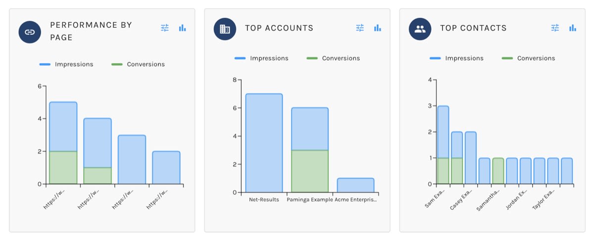
With one CTA selected, Performance by Page breaks impressions and conversions down by the web page the CTA appeared on. A CTA embedded site-wide usually earns most of its conversions on a handful of pages. This is where you find them. The drill-in has a button to open the page in a new tab.
Who Engaged
- Top Accounts: the accounts whose contacts saw and acted on the CTA.
- Top Contacts: the 10 contacts with the most activity. Click a contact to see every event for them, with a button to open their contact record.
The Events Behind Each Number
Every drill-in opens a full-screen list grouped by contact, with each contact's impressions and conversions. Expand a contact to see each event on its own row: the conversion, URL, channel, source, all five UTM tags, and date. With All CTAs selected, a CTA column names the CTA and links to its dashboard.
When a conversion was a form submission, a Form Submission chip shows it. Click the chip to see the values the contact submitted.
Click a contact's name to open their contact record.