Drip Series Dashboard
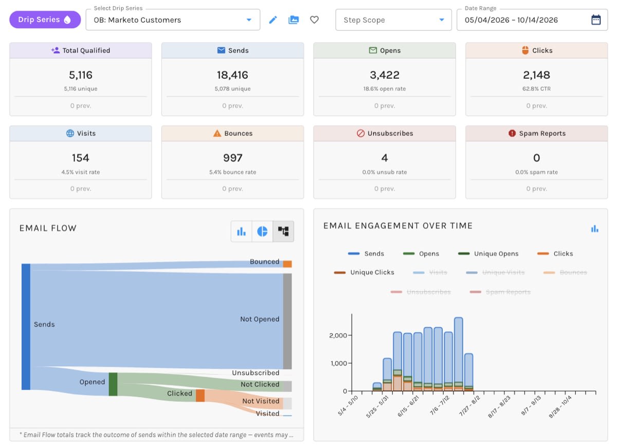
The Drip Series dashboard shows how your Drip Series perform, from the moment contacts qualify to the visit that follows a click.
Look across every series at once to see which ones earn their place, or pick one series and narrow it to a single step to find the email where readers drift away. Every number opens the list of contacts behind it, so you can go from a weak step to the people who need a different message in one click.
The Drip Series Dashboard:
Getting There
- Marketing Center › Automations › Drip Series › Drip Series Dashboard
- Reporting › Dashboards › Automations › Drip Series
- On the Automations table, the dashboard icon (View the Performance Dashboard for this automation) in a Drip Series' actions.
- In the Drip Series builder, the Performance Dashboard button, once the series is running, paused, or retired.
- In the Finder, right-click a Drip Series and choose View Dashboard.
All Drip Series or One Drip Series
Use the dropdown at the top left. It lists All Drip Series and every Drip Series that has launched, by name.
- All Drip Series (the default) adds up every series and adds the breakdown table so you can compare them.
- One Drip Series reports on that series alone. The pencil icon next to the dropdown opens it in the Drip Series builder, and the folder icon shows it in the Finder.
Mark either view as a favorite with the heart icon. The series' id is in the address bar, so you can bookmark a dashboard or send it to a colleague.
Focus on One Step
With one Drip Series selected, the Step Scope dropdown at the upper right narrows the whole page to a single step. Steps are listed in order with the email each one sends, for example "Step 2: Pricing Follow-Up". Choose All Steps in the list to go back; the field then shows just its Step Scope label.
Comparing steps side by side is the quickest way to find the email that loses people. The step you picked is kept in the address bar, so a bookmark brings you straight back to it.
The Date Range
The Date Range picker sits at the upper right. It never reaches into the future, and every number and chart on the page follows it.
- All Drip Series opens on the last 30 days.
- One Drip Series opens on its whole life: from the day it launched to the day it finished, or to today if it is still running. A Drip Series that has not launched yet opens on the last 30 days.
Dates are days in the time zone from your Preferences.
The charts group their bars by the length of the range: daily up to a month, weekly up to six months, monthly up to a year, and yearly beyond that.
The Numbers at the Top
Eight cards summarize the range. Click any card to see the contacts behind it.
- Total Qualified: contacts who qualified, with the number of unique contacts beneath. A contact who qualifies twice counts twice in the total and once in the unique figure.
- Sends: emails sent, with unique recipients beneath.
- Opens: every open, with the open rate (opens ÷ sends). A machine open, where a mail client fetches images before any person has looked at the email, is not counted.
- Clicks: every click, with the click-through rate (clicks ÷ opens).
- Visits: website visits from email links, with the visit rate (visits ÷ opens).
- Bounces: with the bounce rate (bounces ÷ sends).
- Unsubscribes: with the unsubscribe rate (unsubscribes ÷ sends).
- Spam Reports: with the spam rate (spam reports ÷ sends).
When nothing was sent in the range, a rate has no denominator. Rather than show a blank, the card shows the all-time rate and labels it "(all-time)".
Compared to the Previous Period
Each card also shows the same number for the period just before your range, of the same length, labelled "prev.", with the percent change. Pick the last 30 days and you are comparing against the 30 days before that. It is the fastest way to tell whether a dip is real or just a quiet week.
The Charts
Each chart has its own chart-type toggle. Paminga remembers the type you pick, and which series you show, in your browser.
Email Flow
Where your sends went: Sends splits into Bounced, Not Opened, and Opened; Opened splits into Clicked, Not Clicked, Unsubscribed, and Spam; Clicked splits into Visited and Not Visited.
It opens as a Sankey diagram. Switch to a bar chart or a sunburst if you prefer.
Email Flow follows the sends in your range through to their outcome, even when the open or click came after the range ended. That is why its figures can differ from the cards above, which count events that happened inside the range. Both are right; they answer different questions.
Click any part of the flow to see those contacts, including the ones who did not open, click, or visit. Those three lists are the audience for your follow-up.
Email Engagement Over Time
Sends, Opens, Unique Opens, Clicks, Unique Clicks, Visits, Unique Visits, Bounces, Unsubscribes, and Spam Reports over time, as a bar or line chart. Visits, Unique Visits, Bounces, Unsubscribes, and Spam Reports start hidden. Click a series in the legend to show or hide it.
Click a bar to see the contacts behind that series in that period.
Qualifications Over Time
How many contacts qualified in each period, as a line or bar chart. A spike here and a flat Sends line is usually a delivery schedule doing its job (see Delivery Schedule). Click a bar to see who qualified in that period.
Link Clicks
Total Clicks and Unique Clicks for each link in your emails, as a bar or pie chart. Click a bar to see who clicked that link.
The Breakdown Table
With All Drip Series selected, a Drip-Series Breakdown table sits under the charts. It has one row for each Drip Series that has launched (drafts are left out), with its numbers for the range:
- Name and Status
- Qualified and Sends
- Opens, Clicks, and Visits, counted once per contact
- Bounces, Unsubs, and Spam
It is sorted by Qualified, largest first. Sort by any other column to find your best and worst performers. Click a row to open that Drip Series's dashboard. The fullscreen icon at the top of the table gives it the whole screen.
Delivery Schedule
If a Drip Series holds its emails for a delivery window or a time zone rather than sending the moment a contact qualifies (see its delivery settings), its dashboard explains the gap between Total Qualified and Sends.
A banner under the cards says how many qualified contacts are scheduled but not yet sent, and when the next and last sends happen. View schedule takes you to the Delivery Schedule card, which shows:
- A timeline of every delivery group in the range: sent, scheduled, scheduled in a fallback time zone because the contact has none, and failed. Hover over a dot for the detail, or click it to see its contacts.
- The schedule itself, in a sentence: the delivery window, the time zone it uses, and how many contacts have no time zone of their own.
- A progress bar of Sent, Scheduled, Not mailed, and Failed out of every contact who reached an email step, with the next and last sends. Click a figure to see those contacts.
- A table of delivery groups: Email, Time Zone, Contacts, Contact's Local Time, Your Time, and Status. Click a row to see its contacts.
"Not mailed" means the step ran but the contact was bounced, unsubscribed, sunset, or over the send limit. Scheduled sends stay scheduled while the Drip Series is running. Pausing or retiring it freezes them.
The Sends card adds the scheduled count beside its unique figure, too. Click that figure to see the contacts still waiting, not the ones already sent.
The Delivery Schedule appears only on a single Drip Series, and only when it has scheduling turned on.
The Contacts Behind Each Number
Every click on a card, a chart, or the Delivery Schedule opens a full-screen list grouped by contact. The title gives the count, the number of contacts, and the Drip Series you are looking at, so "1,204 Opens · 873 Contacts" tells you at a glance how many people opened more than once.
- Each contact shows how many events they account for. Contacts with five or fewer start expanded. Expand any other contact to see each event on its own row.
- Click a contact's name to open their contact record.
- The list has its own Date Range picker. Change it there and the dashboard behind it follows.
- With All Drip Series selected, each event names the Drip Series it came from. Click that name to open its dashboard.
Columns by Metric
The columns change with what you clicked:
| You clicked | You see |
|---|---|
| Qualifications | Qualified At, Completed At |
| Sends | Email, Clicks, Bounced, Opened, Date |
| Opens | Email, Clicks, Date |
| Clicks | Email, Link Text, URL, IP, User Agent, Sent At, Date |
| Visits, Unsubscribes, Spam Reports | Email, Clicks, Opened, Date |
| Bounces | Email, Hardness, Reason, Date |
| Delivery Schedule groups and figures | Contact Time Zone, Qualified At, Scheduled For, Completed At |
On a bounce list, Hardness tells you whether a bounce was soft (a temporary failure, such as a full mailbox; the contact is not suppressed) or hard (a permanent failure; the contact is suppressed from future sends). Click an email's name to open it in the Email Builder.
Who Is in the Drip Series Right Now
The dashboard reports what happened. To see who is in a Drip Series at this moment, and at which step, use View Participants.